An agency in the United States Department of Commerce
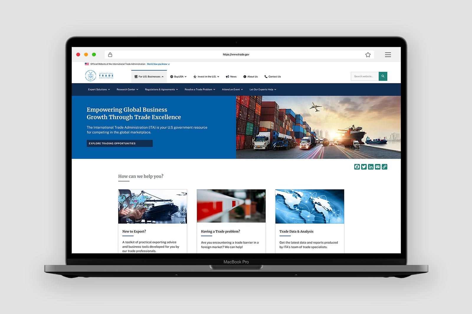
Trade.gov is the official website of the International Trade Administration (ITA), a U.S. Department of Commerce agency that helps American businesses compete in global markets. The site provides export guidance, market data, trade event listings, and policy updates to a wide range of users—from first-time exporters to multinational corporations.
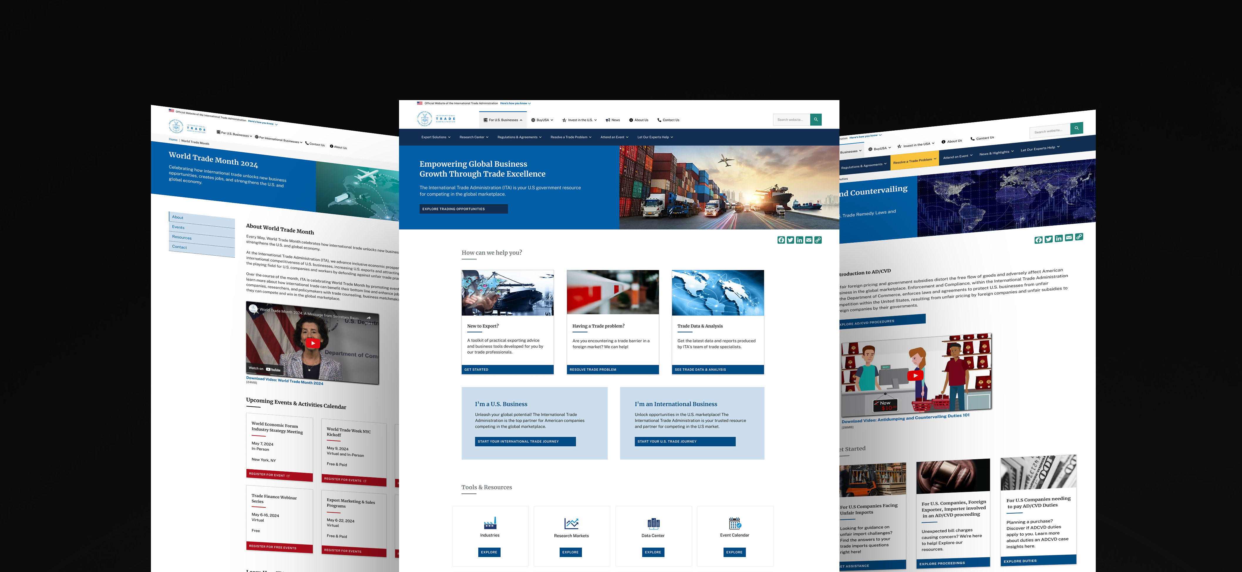
As part of ITA’s digital modernization efforts, I led the UX/UI redesign of the Trade.gov homepage to improve usability, visual clarity, and access to key services. This case study highlights how I applied human-centered design to create a more intuitive and impactful user experience.
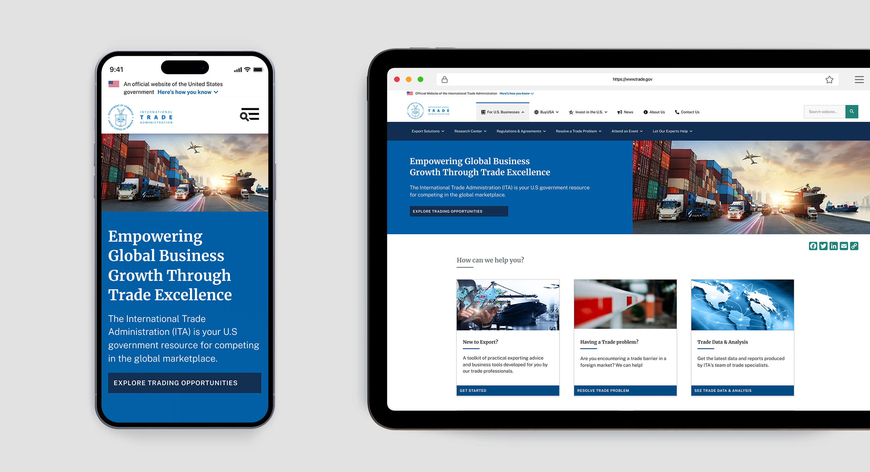
Improved Trade.gov Homepage
The International Trade Administration (ITA) needed a homepage that effectively guided U.S. business owners through a welcoming, informative, intuitive, and visually appealing journey to find the resources they needed to compete in the global marketplace. The existing homepage was not meeting these user needs, leading to difficulty in finding information and contacts.
To transform a clunky, confusing homepage into a strategic digital interface that guides users effortlessly through trade information, resources, and support services. To achieved a design that not only attracted positive feedback in user testing but also allowed rapid deployment—turning design assets into production-ready solutions in approximately 30 minutes.
Lead UX/UI Designer
Digital Strategy Team: OPAD
May - Dec 2023 (12 weeks)
Miro, Figma, UserTesting, SiteImprove, Google Search Console, DealFront, SEMrush
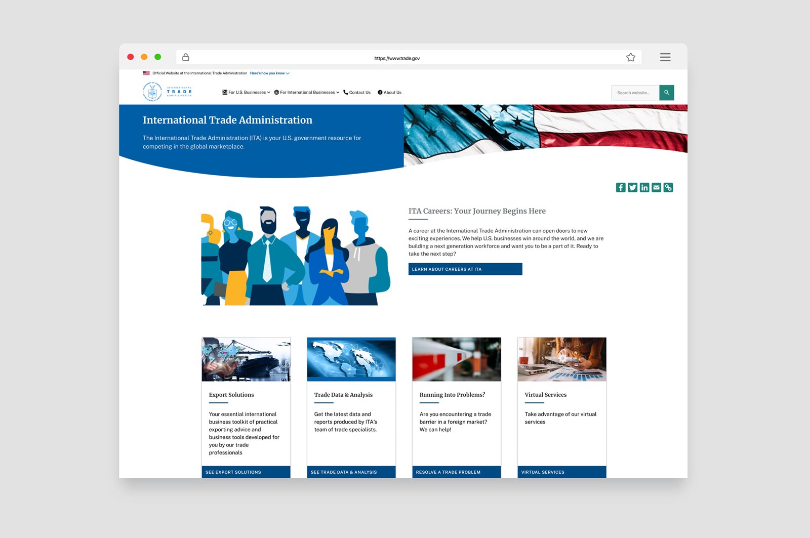
Old Trade.gov Homepage
I collaborated with internal stakeholders across ITA business units to align on key goals: improve usability, prioritize high-demand services, and deliver a homepage that could be implemented efficiently in Drupal.
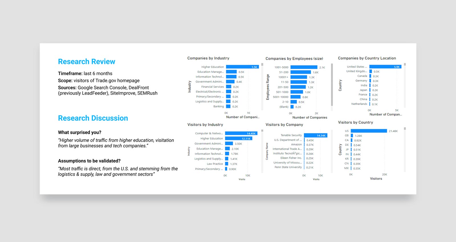
This research helped clarify audience needs and surface early insights that shaped design direction—such as the demand for clearer CTAs, quicker access to trade regulations, and tailored content based on user roles.

This phase focused on translating research insights into actionable design solutions.
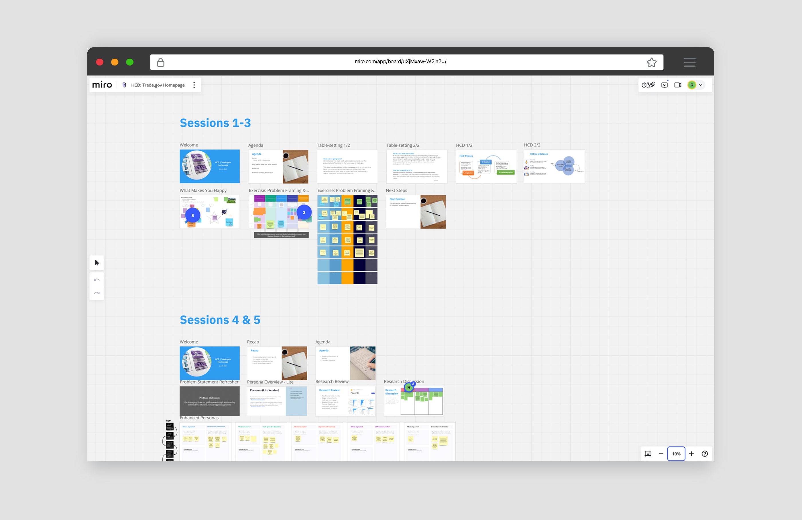
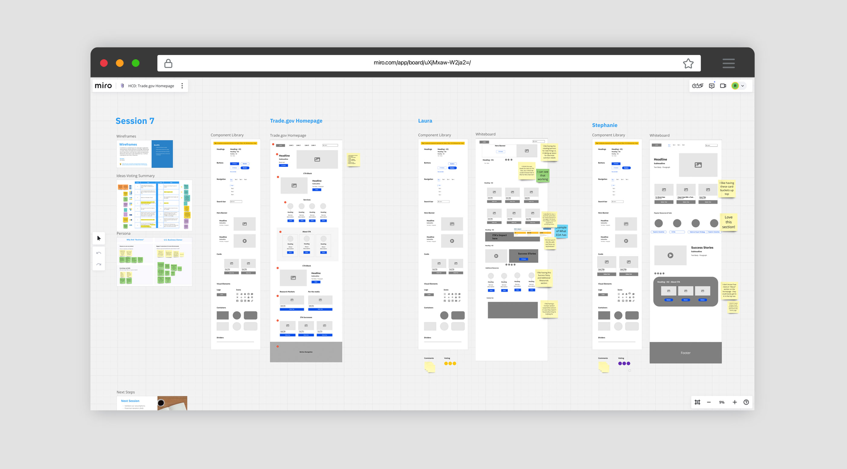
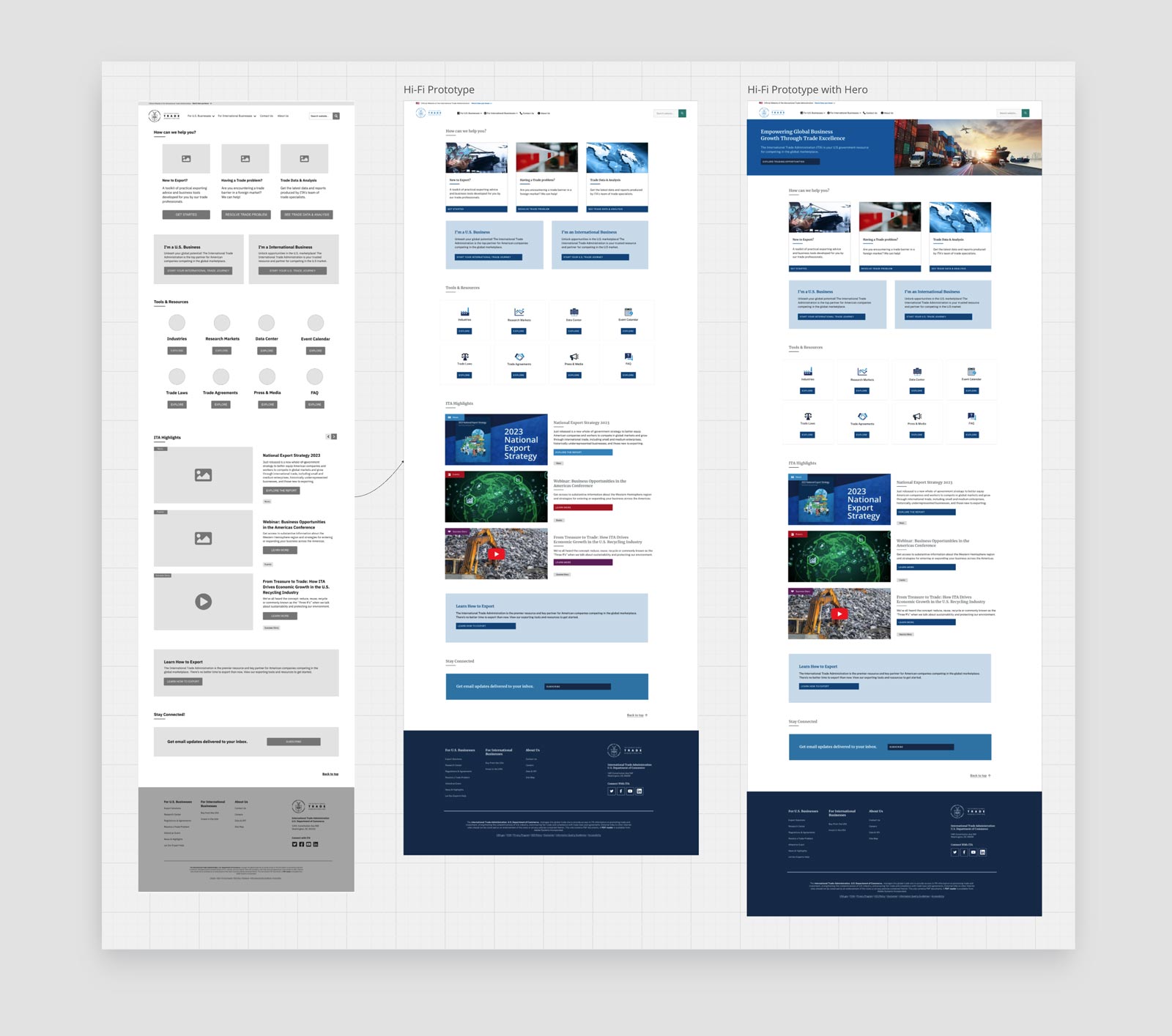
We used Miro to have a remote workshop where we turned research into action—developing personas, mapping user needs, and brainstorming design ideas. We created wireframes and prototypes, then vetted each concept for feasibility within the Drupal CMS to ensure practical, user-centered solutions.

Human-Centered Collaboration

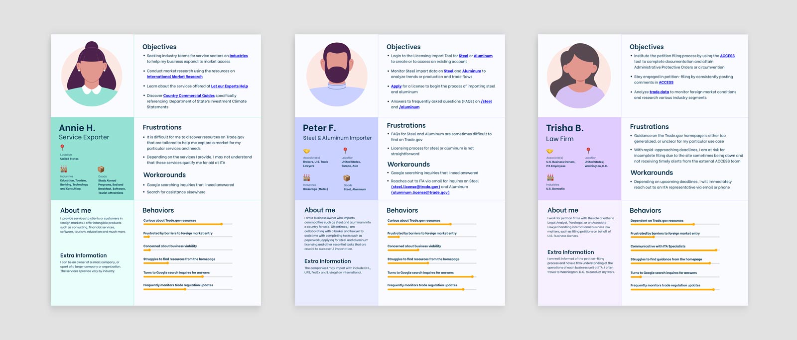
Persona Development
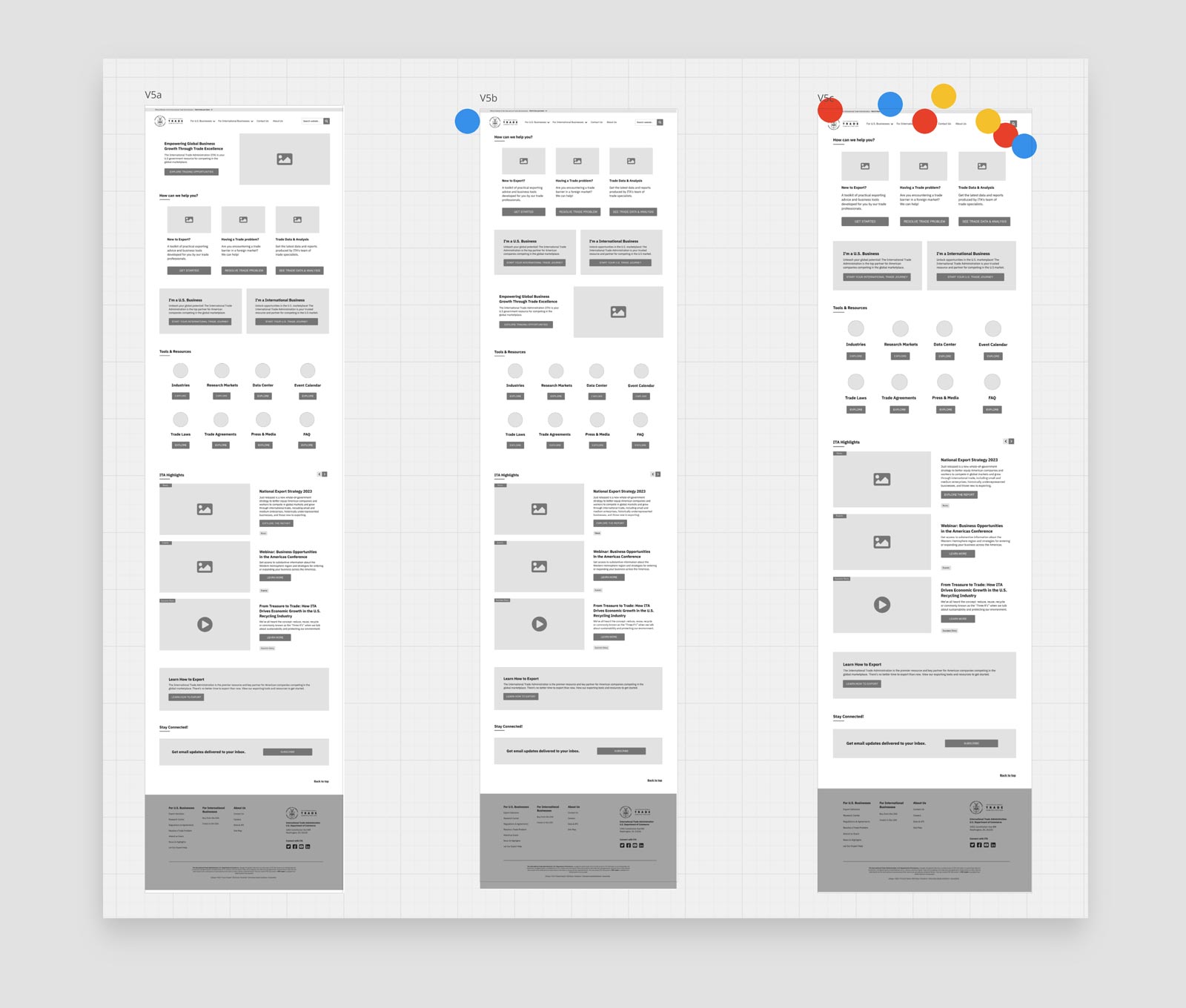
We modeled our ideas through visualizations using Miro, developing multiple wireframe versions.
I then translated low-fidelity sketches into structured layouts that prioritized user needs and content hierarchy. These early wireframes served as the foundation for the final prototype built in Figma, which we tested with real users to validate the design. Feedback from testing sessions directly informed layout refinements, CTA clarity, and overall usability improvements.

Wireframing Workshop

Version C was selected by the Cohort for user testing against the current control (current homepage).

Refined the Vision
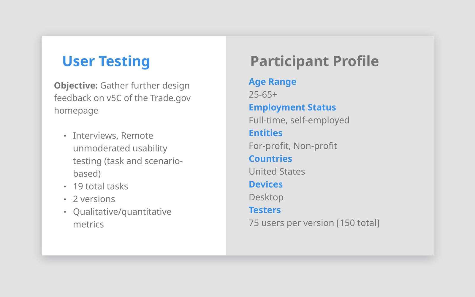
To ensure the redesign met user needs, we conducted usability testing with key audience segments. This phase allowed us to validate design assumptions, measure performance, and gather direct feedback on clarity, navigation, and overall experience.
Insights from this testing shaped final refinements and confirmed the design’s effectiveness before implementation.

User testing - Methodology

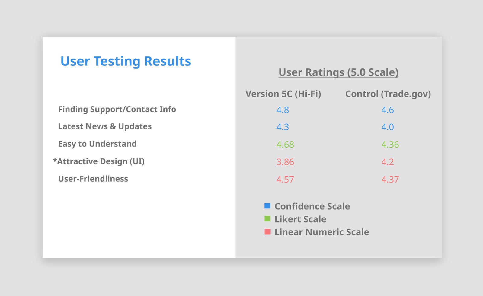
User testing - Quantitative Feedback
User testing revealed clear patterns: participants rated the new design higher in visual clarity, ease of navigation, and relevance of content. Quantitatively, top sections identified were “Services,” “Tools & Resources,” and “Contact.”

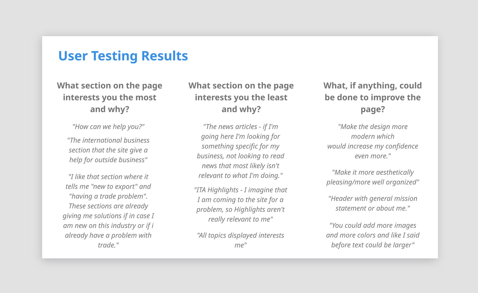
User testing - Qualitative Feedback
Qualitatively, users appreciated the clean layout and direct CTAs, with feedback like “I can quickly find what I need without digging.” These insights guided final refinements.
The redesigned homepage delivered a more intuitive and accessible user experience—making it easier for businesses to discover export services and resources.
The streamlined layout, improved CTAs, and content prioritization led to increased user engagement and a faster implementation process, all while aligning with ITA’s goals and Drupal constraints.
increase in user satisfaction (UI clarity, layout, CTA visibility)
of users prioritized the “Services” section, followed by 40% for “Tools & Resources”
of testers found CTAs easier to locate and understand

Improved Trade.gov Homepage
This project demonstrated the strategic value of applying human-centered design within CMS and technical constraints to deliver scalable, high-impact solutions for federal digital services.
Key learnings included the importance of early cross-functional alignment, designing for modularity in Drupal, and validating assumptions through rapid prototyping and testing.
Looking ahead, our roadmap includes:
Check out more of my projects, or reach out if you want to learn more about this one.